
Metropolis Underground
Product Design Challenge
Problem:
Metropolis Underground no longer accepts paper tickets, nowadays the service requires people to charge a top-up card with money. Unfortunately, this operation can only be done in Underground stations at the moment.
My goal:
Design the mobile app to improve the experience of MU customers with the top-up card, allowing customers to top-up online and avoid long queues at the station. Also, enrich the
Approach:
Due to nature of the exercise and the time limitation, my focus should be on the main challenge goals and user needs without spending an excessive amount of time. To design this experience, I followed a process which is based on a user-centred design approach:

Step 1: Understand & research
The first step was to understand well the main goal that the MU app wanted to accomplish. From the info given I understood that the main goal of MU app is to “improve the experience of MU customers with the top-up card”. So my main focus was to solve the top up process through the app but having into account the extra data given when ideating my solution to see how I could enrich the experience. The extra data given was:
Cash balance of each customer
Journey history
When a card is enabled, disabled and expired
Real-time incidents on the network
Average pick-up time for trains
Number of passengers per wagon
Number of customers per station
Then I did a competitive analysis on the solutions already existing on the same domain. This provided me with a good insight into the features, functions and flows already done by the competitors.

Step 2: Empathise
To craft a meaningful user experience I first asked: ¿Which different type of users would use the MU card?
¿Which would be their main goals when topping up online & using the app? From there I identified two types of users and listed their main goals to help me ideating features that directly address their needs:


Step 3: Ideation
Prioritising Key features
I then prioritised the key features for the initial release based on the main goal of the challenge: allowing customers to top up through the app. I also included extra features based on the given data that would really benefit the UX.
I could see some extra features that would benefit the app but they where out of the scope of this exercise, leaving them for future iterations.
NFC technology: After my competitive analysis I saw that all transport companies are using NFC cards nowadays. I chose this technology as it would speed up the top-up process and most of the phones include this technology already. For those that don’t, a manual option would be included.
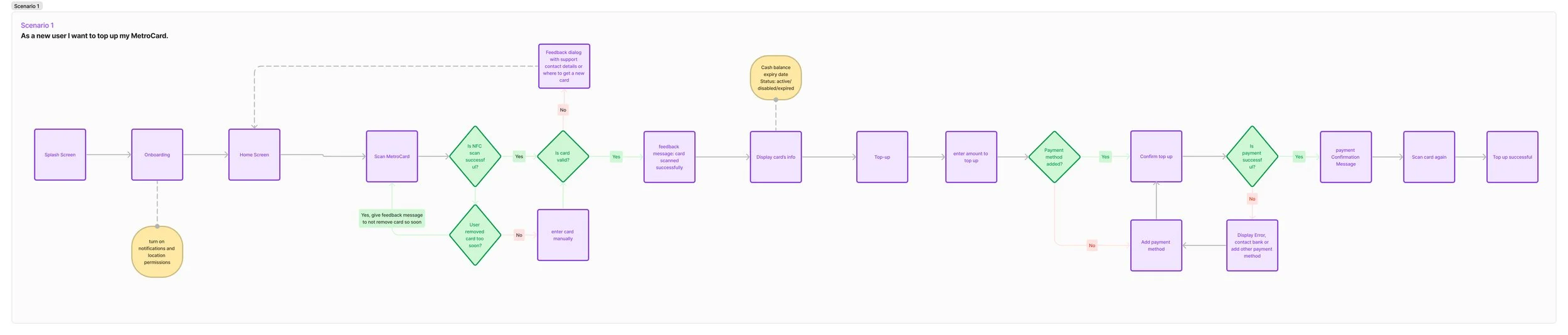
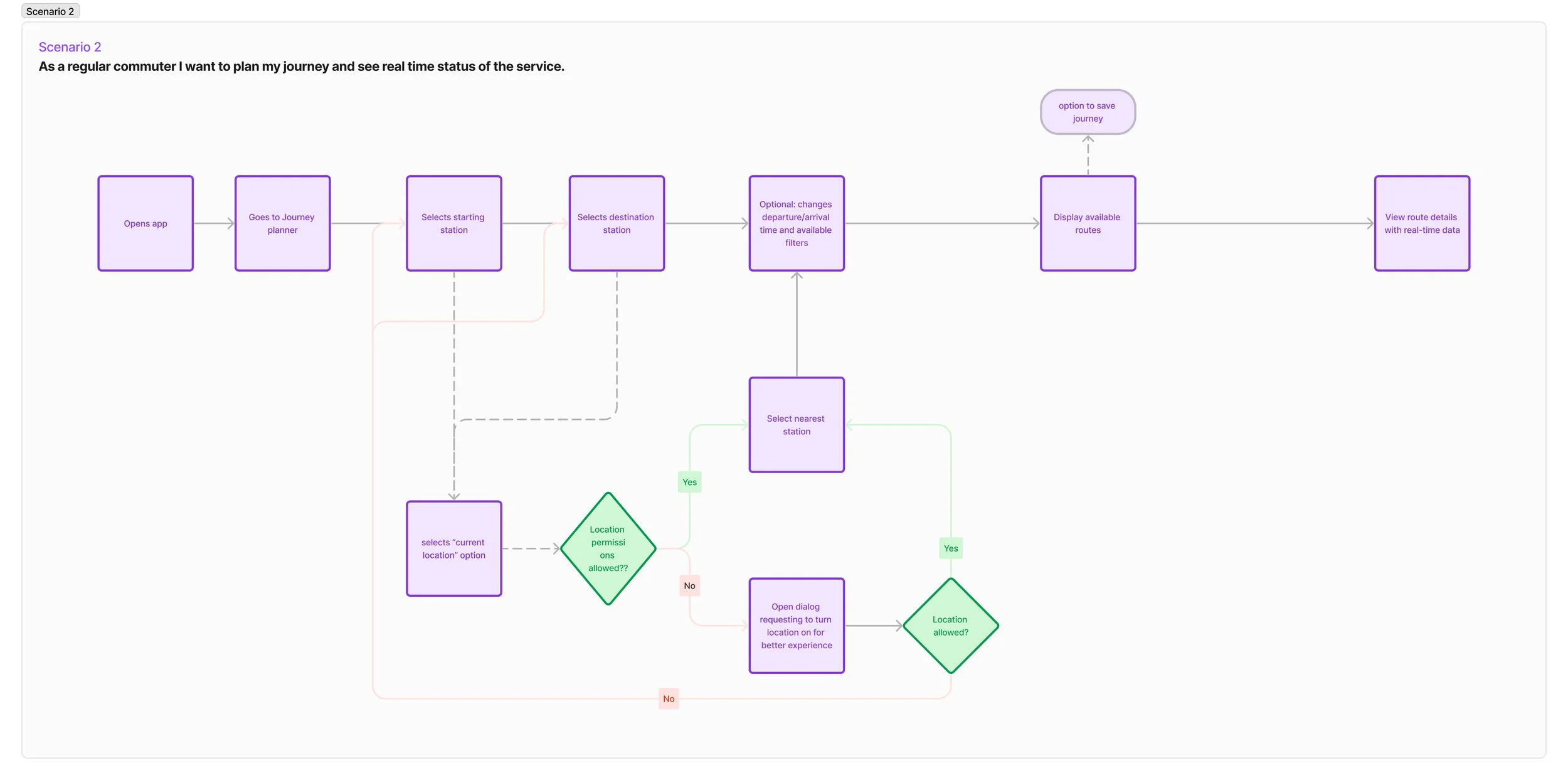
Main user flows
Next step was to define the main user flow that in my opinion best addresses the app main challenge: topping-up. Additionally, I designed a second flow to improve the overall app experience, using the data points provided:

Step 4: wireframes & test
Sketching the idea
After defining the user flows, I transitioned to sketching my ideas. I created the wireframes for both flows with the help of a wireframing library, which enables me to create quick designs taking into account real size of final elements and its hierarchy.
Testing
I quickly tested the wireframes with people and was able to get insights on how they used it and refined the screens accordingly based on their feedback.


Step 5: UI design & Prototype
Metropolis Underground brand
In order to move on to the final screens, I created MU’s brand. I designed the logo based on the “Route” icon from Material symbols, which I initially used on my wireframes and realised that could be tweaked to contain the M and U of Metropolis Underground while also communicating the concept of Journey from point A to point B.


App colors & Font
I defined the colours for the app, adjusting the primary color used on the app for accessibility purposes. I included a secondary color as a greyscale and feedback colours.
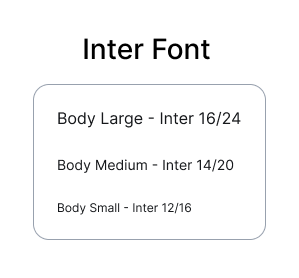
I chose “Inter” font for the app as it’s a Google Font and everyone would have it when sharing my files.
Ideally I would have combined Oldschool grotesk for titles with Inter for text to give more personality to the app.

Next Steps
In a real case, before the initial launch the team would have set of KPIs to measure the success of the app. Future iterations would be guided by user feedback and by seeing the app usage in real life. An example of these KPIs could be:
User Adoption Rate: % of MU customers who have downloaded and actively use the app.
Top-Up Conversion Rate: % of users who successfully complete the top-up process compared to the total number of app users.
User Engagement: number of daily and monthly active users, session duration, etc.
Customer Retention Rate: % of users who continue to use the app over time, indicating customer loyalty.
User Feedback and Ratings: Collect and analyze user reviews, ratings, and feedback to gauge user satisfaction and identify areas for improvement.
Feature Adoption: evaluate the adoption rates of key features, such as notifications and real-time incident alerts, to understand which functionalities resonate most with users.
Conversion Funnel: Analyze user behavior within the app by tracking key steps in the top-up process, identifying any drop-off points.